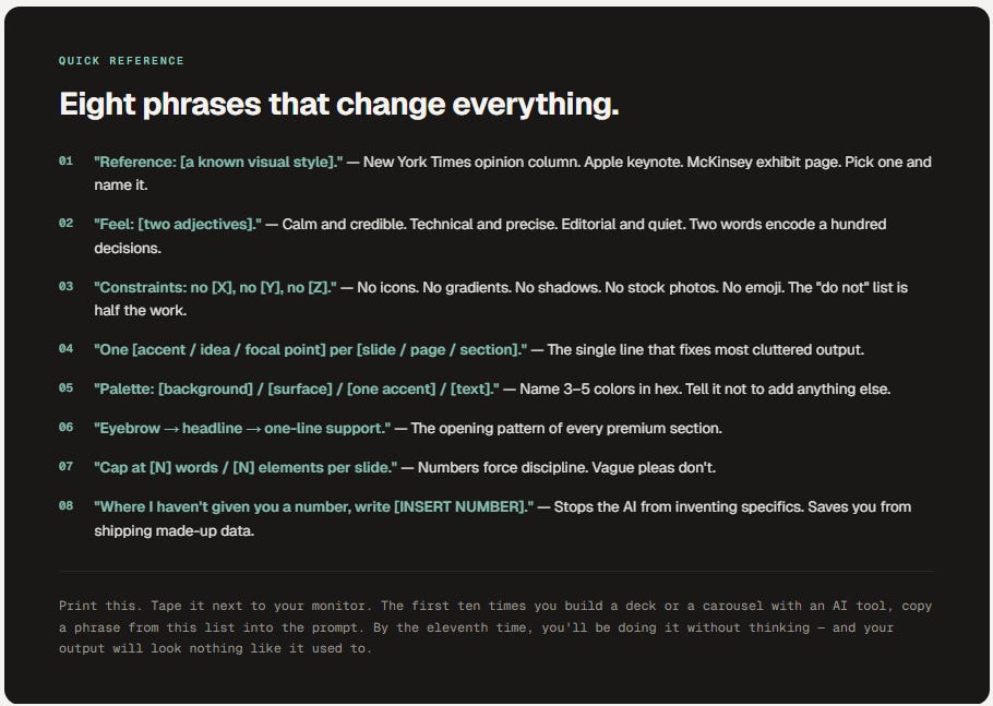
How to Talk to AI Like a Designer
The vocabulary industrial folks need to make AI tools — Claude, Gamma, Manus AI, Perplexity — stop producing slop.

Reference / Working Glossary
Read time · 12 minutes
Works with · Claude, Gamma, Manus AI, Perplexity, Canva AI, ChatGPT, Gemini, Grok
What you get · 60+ terms · translation table · 3 worked examples
When you ask an AI tool for a slide deck, a LinkedIn carousel, or a one-pager, the words you choose are the job. "Make it look professional" gets you a stock photo and a gradient. The vocabulary in this guide gets you something that looks intentional, premium, and unmistakably yours — built for the VP of O&M, the plant manager, the engineer, and the operator who never went to art school but ships visual work all day.
Pattern · 01 / The Premise
Why words are the lever.
The bottleneck isn’t the AI. It’s you describing what you want.
The model has the talent. It has seen millions of decks, magazine spreads, annual reports, billboard campaigns, and editorial layouts. It can produce something genuinely good — when you tell it what good looks like.
The problem is that most people ask the way they’d ask a junior assistant. “Make it look professional.” “Make it pop.” “Add some color.” The model has no idea what you mean, so it averages across every “professional slide” it has ever seen and gives you the average. The average is terrible. Stock photos. Drop shadows. Three colors in a row that nobody chose. A pie chart nobody asked for.
Designers don’t talk that way. They name specific things — weight, leading, contrast, hierarchy, focal point, density, alignment, mood — because those are the dials you actually turn to make something look like something. When you learn the same vocabulary, the AI stops guessing. It executes.
This guide is the vocabulary. Every section names the terms designers use, what they mean, and how to drop them into a prompt the next time you’re staring at a screen at 11pm trying to make a turnaround proposal not look like every turnaround proposal.
Pattern · 02 / Frame the Ask
The brief itself.
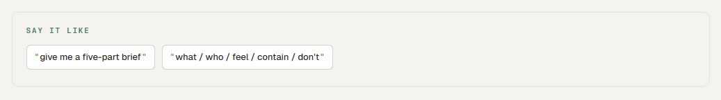
Before you ask for anything visual, give the AI the brief. Five short lines beats a paragraph of vibes every single time.
The Five-Part Brief.
aka the only template you need
What it is. Who it’s for. What it should feel like. What it must contain. What it must not do. Five lines, and the AI has more direction than most marketing departments give a designer.
What: 6-slide LinkedIn carousel.
Who: maintenance planners at refineries.
Feel: calm, technical, credible.
Contain: 3 reasons turnaround packages drift.
Don’t: icons, stock photos, gradients.
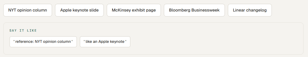
The Reference Move.
aka “make it look like X”
Naming a known visual style is the fastest cheat code in prompting. The AI has indexed every magazine, brand, and museum on the internet — point at one and it knows what to do.
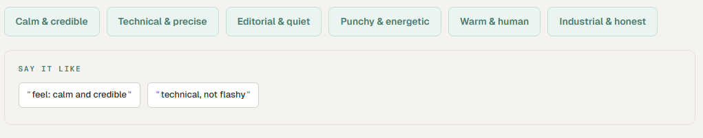
Naming the Feeling.
aka mood words
Designers reach for emotional words because they cluster a hundred decisions at once. “Calm and credible” rules out neon, drop shadows, and bold gradients without you having to list them. Pick two adjectives. Use them every time.
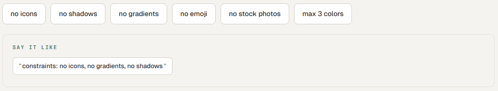
Constraints as a Feature.
aka the “do not” list
Half the work of looking premium is what you removed. Telling the AI what NOT to do is faster than describing what to do — and it’s the single biggest difference between a prompt that produces something polished and a prompt that produces a Christmas tree.
Pattern · 03 / The Bones
Structure & layout.
How the page or slide is divided. Get this right and most other things fall into place.
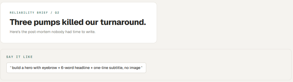
Hero.
aka the opening, the cover slide
The first thing someone sees. On a slide deck it’s the cover. On a carousel it’s slide 1. On a one-pager it’s the top third. Big headline, supporting line, one visual element. No more.
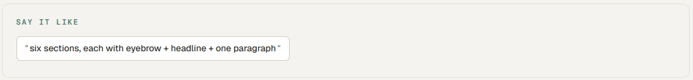
Section.
aka content block, a slide
A horizontal band of related content with its own headline. A 6-section page is a 6-slide deck is a 6-card carousel. Same logic, different format.
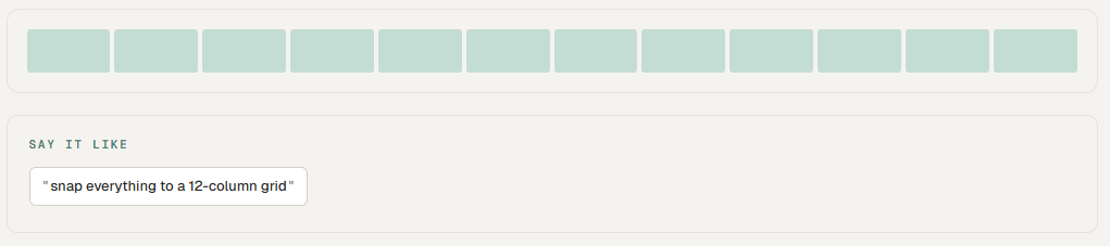
Grid.
aka columns system, layout grid
Invisible vertical lines that everything snaps to. A 12-column grid is the standard. Telling the AI to “snap everything to a 12-column grid” eliminates the thing that makes amateur layouts feel off — elements that almost align.
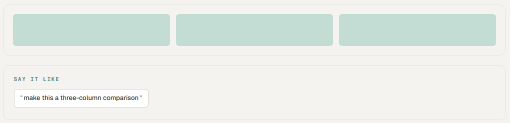
Columns.
aka content columns
Vertical sections that hold content side by side. Three equal columns is the most common card layout — comparison, three steps, three pillars. Two columns is for compare-contrast.
Above the Fold.
aka first viewport, the cover
What you see before you scroll. The most valuable real estate on any page or any slide. If the message isn’t here, most people never see it.
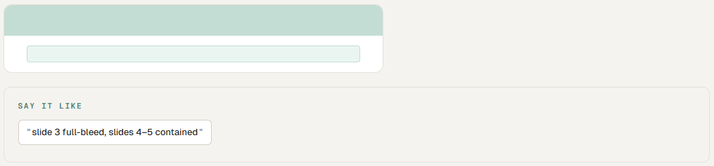
Full-Bleed vs. Contained.
aka edge-to-edge vs. boxed
Full-bleed = visual runs to the edges. Contained = content stays inside a centered box with margins. Full-bleed feels modern and immersive. Contained feels editorial and structured. Most premium decks alternate.
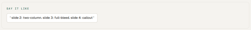
Slide Layout.
aka the master template
Every premium deck uses 4–6 layouts on repeat: title-only, title plus body, full-bleed photo with overlay, two-column, callout, and end-card. Naming the layout is more powerful than describing what should go on it.
Pattern · 04 / The Secret Sauce
Spacing & rhythm.
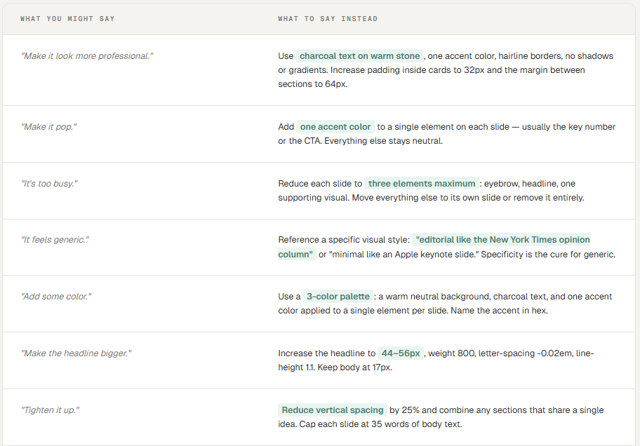
Designers will tell you 80% of the difference between cheap and premium is just spacing. They’re not exaggerating.
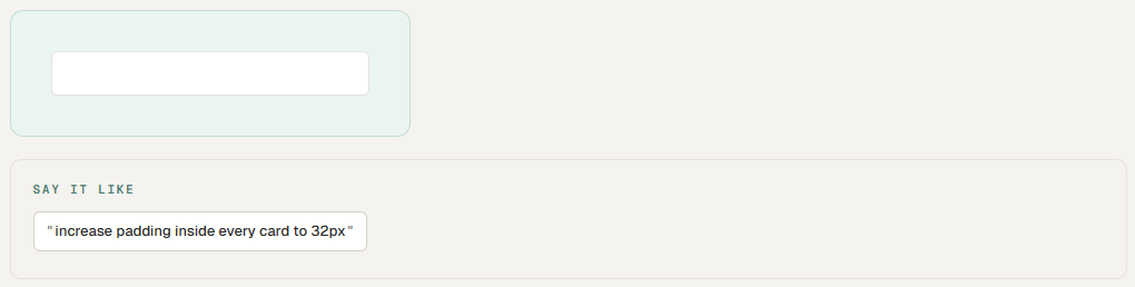
Padding.
aka inner space, internal spacing
Space INSIDE an element, between its edge and its content. Big padding inside a card = roomy and premium. Tight padding = compact and dense. The single fastest way to make a slide feel expensive: increase padding.
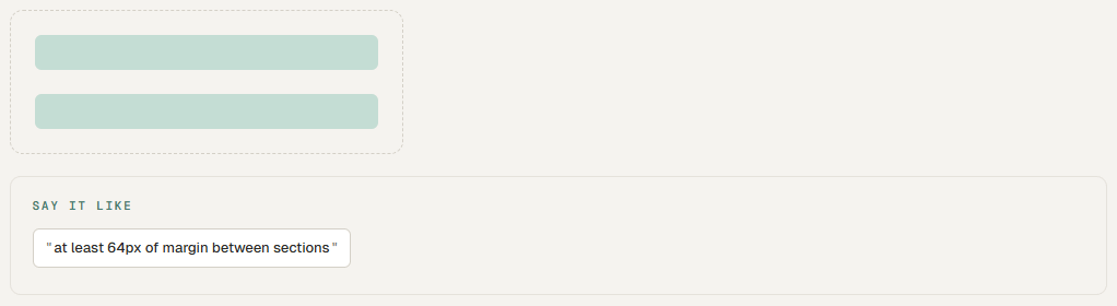
Margin.
aka outer space, external spacing
Space OUTSIDE an element, between it and its neighbors. Pushes things apart. The dashed area is the margin around the green blocks. Margin is what creates breathing room between sections.
Whitespace.
aka negative space, breathing room
Empty space. Not a mistake — the point. Whitespace tells the reader where to look and makes the content that IS on the page feel important. Premium brands use a lot of it. Discount brands cram every pixel.
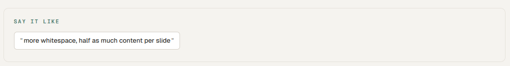
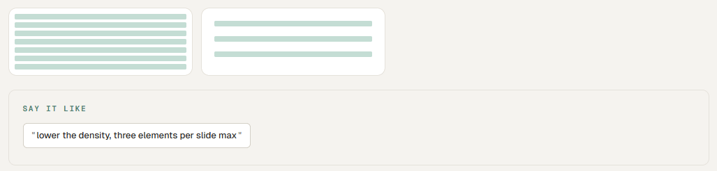
Density.
aka information density
How much stuff is packed into a given area. Low density = roomy, premium, easier to read. High density = data-dense, technical, harder on the eyes. A board memo wants low density. A reliability dashboard wants high density. Match the density to the use.
Vertical Rhythm.
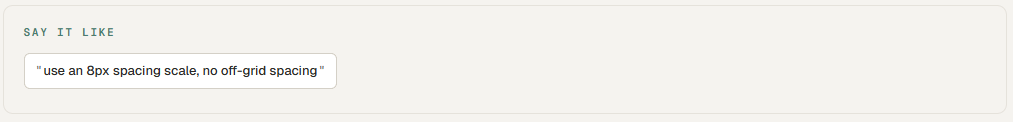
aka spacing scale
The repeating beat of space between elements. Good design uses a consistent scale (8, 16, 24, 32, 48, 64) instead of random numbers. The AI gets this right when you tell it to. It guesses when you don’t.
Pattern · 05 / Type
Typography.
The voice of the page. Most “this looks bad” judgments come from type before anything else.
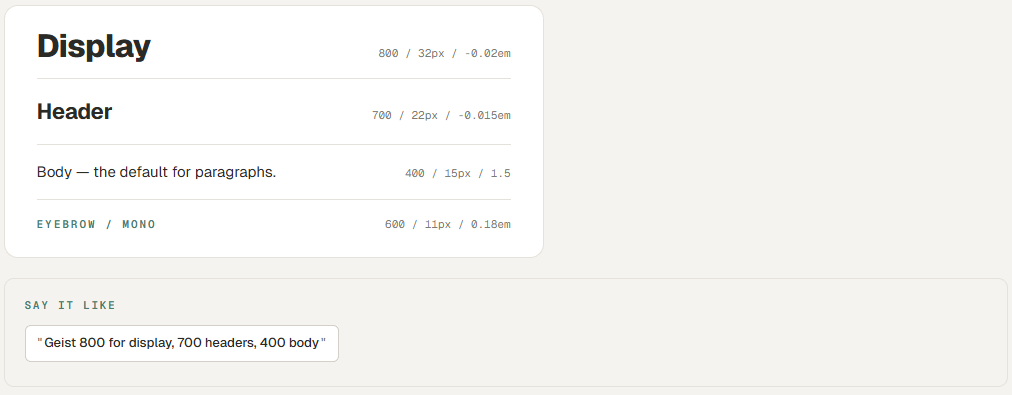
Font Weight.
aka how thick the letters are (300–800)
Modern type families have 5–8 weights. Weight does the heavy lifting of hierarchy — you don’t need a second font, you need the right weights of one. 800 for display, 700 for headers, 600 for emphasis, 400 for body, 300 for captions.
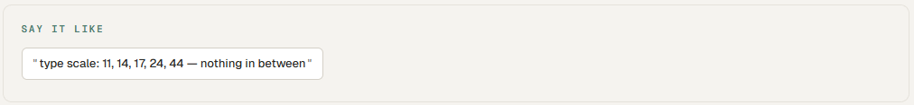
Type Scale.
aka size hierarchy
The set of font sizes you use. Pick 4–5 sizes and stick to them: 11, 14, 17, 24, 44 is a fine scale. The mistake is using 12 different sizes — the page feels chaotic.
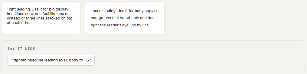
Leading.
aka line-height, line spacing
Vertical space between lines of text. Tight leading (1.1–1.2) for big headlines. Loose leading (1.5–1.7) for body copy. Bad leading is the #1 reason long text on a slide looks like a wall.
Tracking.
aka letter-spacing
Space between letters. Negative tracking (tight) on big headlines makes them feel modern. Positive tracking (wide) on small uppercase labels makes them feel editorial. Wrong tracking instantly says “amateur.”
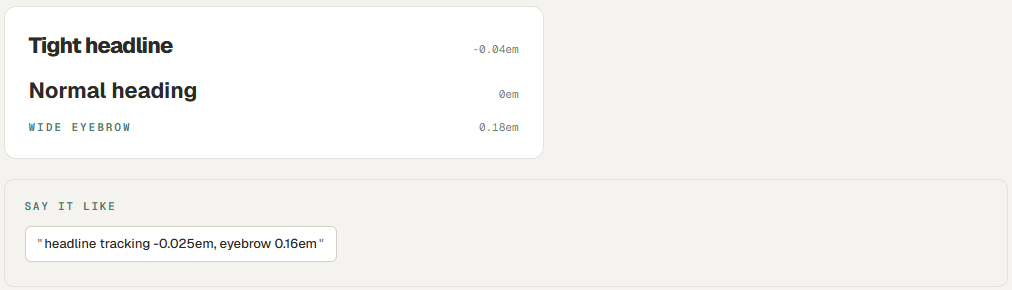
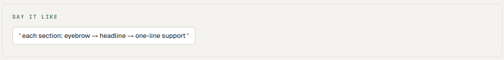
Eyebrow → Headline → Support.
aka the editorial stack
The premium pattern at the top of every section. A small uppercase label (eyebrow) tells you the category. A big headline tells you the point. A short subtitle adds context. Three lines, all the work.
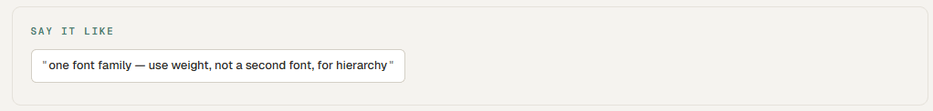
One Family, All Weights.
aka the no-second-font rule
You don’t need a second font. Geist, Inter, IBM Plex Sans, Söhne, or Helvetica Now in 5 weights does more than any pairing. The “designer who picks two fonts” thing is the wrong fight 95% of the time.
Pattern · 06 / Color
Color & mood.
Color is mood. Get the mood right and the rest follows.
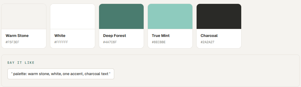
Palette.
aka the whole color set
The full set of colors you’ll use. A premium palette is small — usually 3–5 colors. A page background, a content surface, one accent, charcoal text, and maybe a faded version of the accent. That’s it.
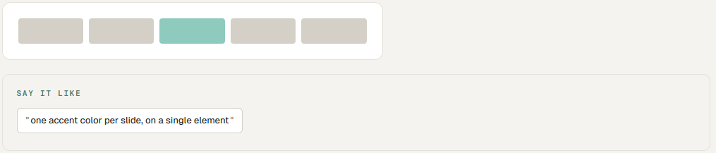
Accent.
aka the one color that pops
The single color that draws the eye. One accent per page is the rule. Two accents is a compromise. Three is a clown suit. Use the accent on what matters most — a CTA, a key number, a section divider.
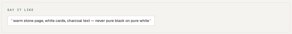
Neutral.
aka the supporting cast
The grays, off-whites, and tans that hold the page together. Pure black on pure white feels harsh. Charcoal on warm stone feels human. Pick neutrals that are slightly warm or slightly cool — never neutral-neutral.
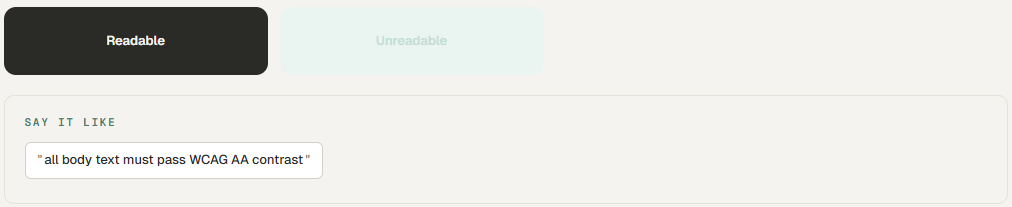
Contrast.
aka readability, accessibility
The difference in lightness between text and background. High contrast is readable. Low contrast looks pretty in a Figma file and unreadable in an email. The block on the right below is what bad contrast looks like.
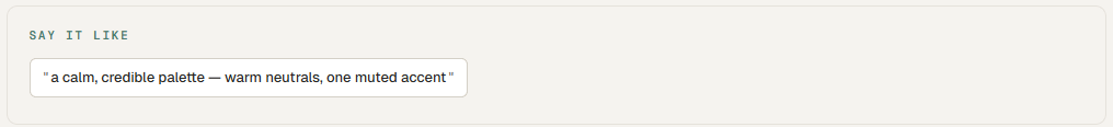
Mood Words.
aka the shortcut to a palette
Asking for “a calm, credible palette” gets you something usable. Asking for “blue and gray” gets you a 1998 corporate intranet. Mood words encode dozens of decisions — saturation, temperature, pairing — into two adjectives.
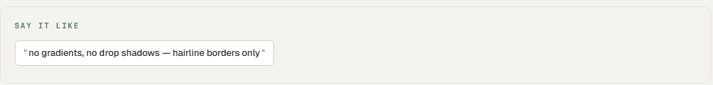
No Gradients, No Shadows.
aka the modern minimalism rule
Both gradients and drop shadows date a design instantly. They were the look of 2010s startup decks. The current premium look is flat color, hairline borders, and generous whitespace. If you want to look modern, just say no.
Pattern · 07 / Composition
Composition.
Where the eye goes, in what order, and why. The invisible directing of attention.
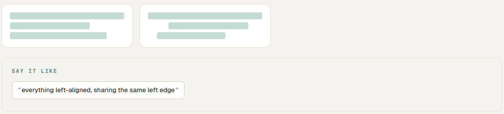
Alignment.
aka edges that line up
Things on a page should share invisible left, right, or center edges. Misalignment by even 4 pixels is the thing your eye hates and your brain can’t name. Left-aligned is editorial. Center-aligned is for one-line statements only.
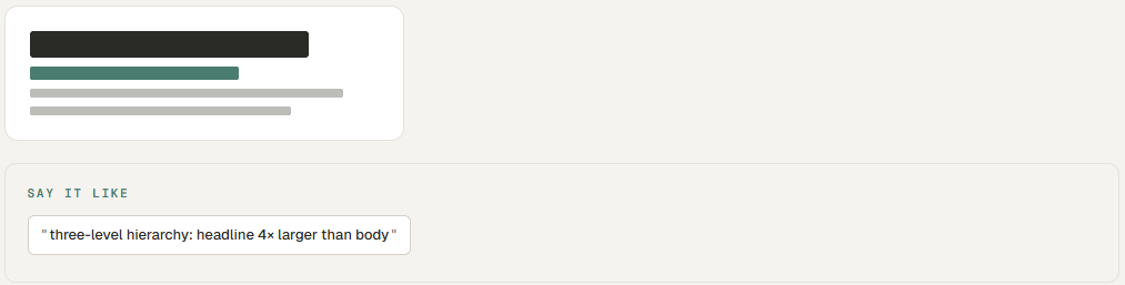
Hierarchy.
aka what reads first, second, third
The order the eye picks things up. Big and bold reads first. Small and gray reads last. Most amateur work has no hierarchy — every element is fighting for attention, so none of them get it.
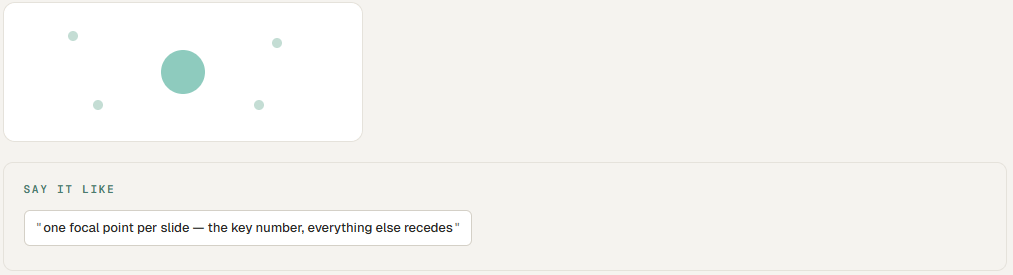
Focal Point.
aka the hero element
The one thing on the page that wins. There can only be one. Make it bigger, bolder, or the only thing in the accent color — but only one of those, not all three.
Negative Space.
aka let it breathe
The empty area around your content. The most underused tool in industrial decks. A slide with one sentence and a lot of empty space around it lands harder than a slide with seven bullets. Always.
Balance.
aka does it tip over
When you squint at the page, do the visual weights feel even — or does one corner feel heavy? Symmetric balance is calm and formal. Asymmetric balance is dynamic and modern. Both are fine; “off-balance” is not.
Pattern · 08 / Imagery
Imagery.
When you do use a photo, here’s how to ask for one that doesn’t look like LinkedIn 2014.
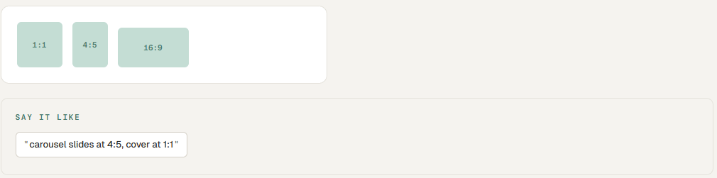
Aspect Ratio.
aka the shape of the image
Square (1:1) for social. Portrait (4:5) for LinkedIn carousels. Wide (16:9) for slides. Naming the ratio up front saves you from getting an image that’s been mangled to fit.
Full-Bleed Image.
aka edge-to-edge photo
A photo that covers the entire slide with text overlaid. Premium move for cover slides and section dividers. Looks expensive when paired with a darkening overlay so the type stays readable.

Candid vs. Stock.
aka real vs. fake
Stock photos of “factory workers smiling” are uniformly terrible. Always have been. Always will be. Either use real photos from your site, real iPhone photos from a job site, or skip the photo entirely and let typography do the work.
Monochrome Treatment.
aka the editorial photo trick
Convert any photo to black-and-white or a tinted single color. Instantly takes a mediocre image and makes it look intentional. Editorial magazines do this all the time. Almost no industrial decks do it. They should.
The Industrial Photo Problem.
aka why stock falls apart for our world
There are maybe twelve good stock photos of refineries on the internet, and you’ve already seen all of them. Same with pump skids, well sites, and control rooms. If imagery matters, get a real one. If it doesn’t, replace it with a typographic slide and a single accent shape. That looks better anyway.
Pattern · 09 / Voice on the Page
Voice on the page.
Industrial folks over-explain. Slides should be condiments, not the meal.
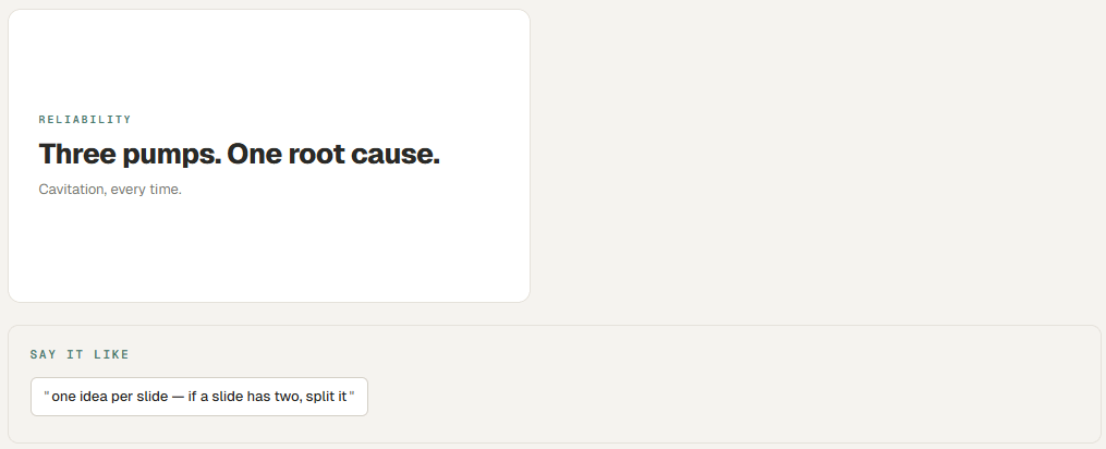
One Idea Per Slide.
aka the discipline rule
Every slide has one idea. If you have two ideas, you have two slides. The most common bad-deck mistake is cramming three points onto one slide because someone is afraid of “too many slides.” Nobody is afraid of too many slides. They’re afraid of bad ones.
Punchy Declarative.
aka stop hedging
Headlines on premium slides are short, declarative, and have a point of view. “Three Pumps Killed Our Turnaround” is a headline. “An Overview of Pump Performance Issues During Q2” is a section in a textbook.
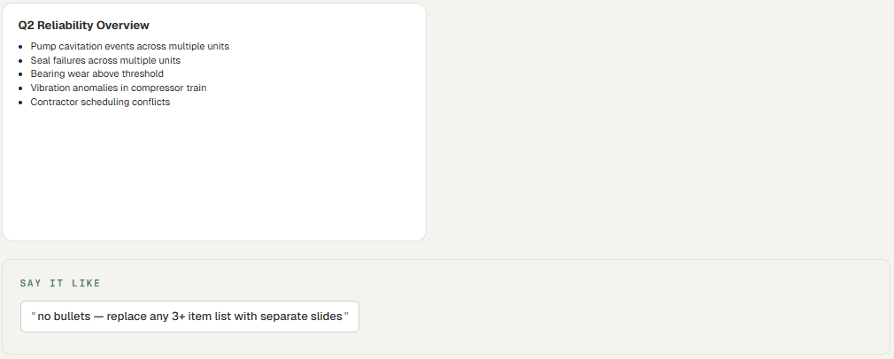
No Bullets (Almost).
aka the bullet ban
Bullet points are where ideas go to die. They flatten everything to the same weight. If you must have a list, make it three items max, each a complete sentence. Otherwise: turn each bullet into its own slide.
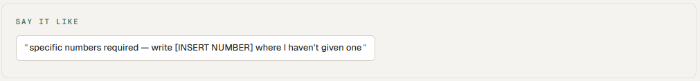
Specific Numbers.
aka the credibility shortcut
“$56K/year in lost engineering time” lands. “Significant cost savings” doesn’t. The AI defaults to vague unless you push it. Tell it to use specific numbers, and if you don’t have them, tell it to leave the placeholder visible so you remember to fill them in.
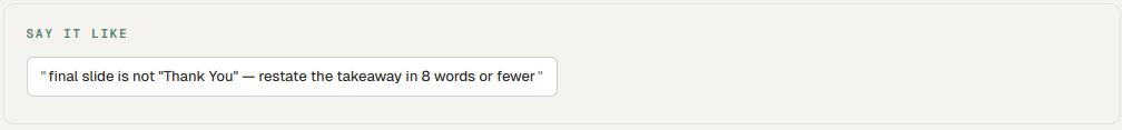
The Last Slide.
aka NOT “Questions?”
A “Thank You” or “Questions?” slide is the most wasted real estate in any deck. The last thing on the screen should be the takeaway you want them to remember. Patrick Winston’s MIT lecture rule: the last slide highlights contributions, not gratitude.
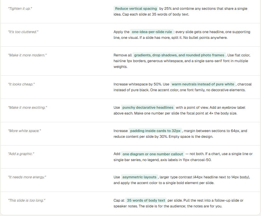
Pattern · 10 / Vague → Precise
The translation layer.
Vague words on the left. The same idea, said the way an AI tool can act on it, on the right. This is the page worth bookmarking.
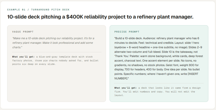
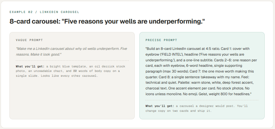
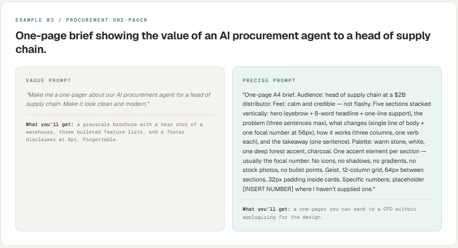
Pattern · 11 / In the Wild
Three industrial examples.
The same vocabulary applied to three real industrial use cases. Vague prompt on the left, precise prompt on the right, and what each one will actually produce.
Pattern · 12 / Across Every Tool
A note on tools.
The vocabulary in this guide is portable. The tool you happen to use this week matters less than you think.
laude PPT, Claude Design, Gamma, Manus AI, Perplexity, Canva AI, Beautiful AI, Tome — every one of them is a thin layer on top of a large language model that has read every design book and brand book on the internet. They differ in interface and in how they format the output, but they all respond to the same vocabulary.
Each one weights certain words slightly differently. Gamma loves the word editorial. Claude responds best when you give it explicit constraints (the “do not” list). Perplexity wants source-aware framing — tell it where its information should come from. Manus AI does well when you describe the layout in spatial terms (top-left, full-bleed, two columns).
None of that matters if you can’t name what you want. Once you can — the language in this guide — you’ll get usable output from any of them. And when a new tool launches next month that’s better than all of them, you’ll know exactly how to talk to that one too.
The model is not the bottleneck. It hasn’t been for a while. The brief is.